work.
A curated selection of recent projects. Most started with a logo and grew from there.
Here are some projects that I really enjoyed working on. I've selected these because they stood out to me visually and conceptually, while also representing some solid collaboration between the client and me. Take a look!
DeLuna
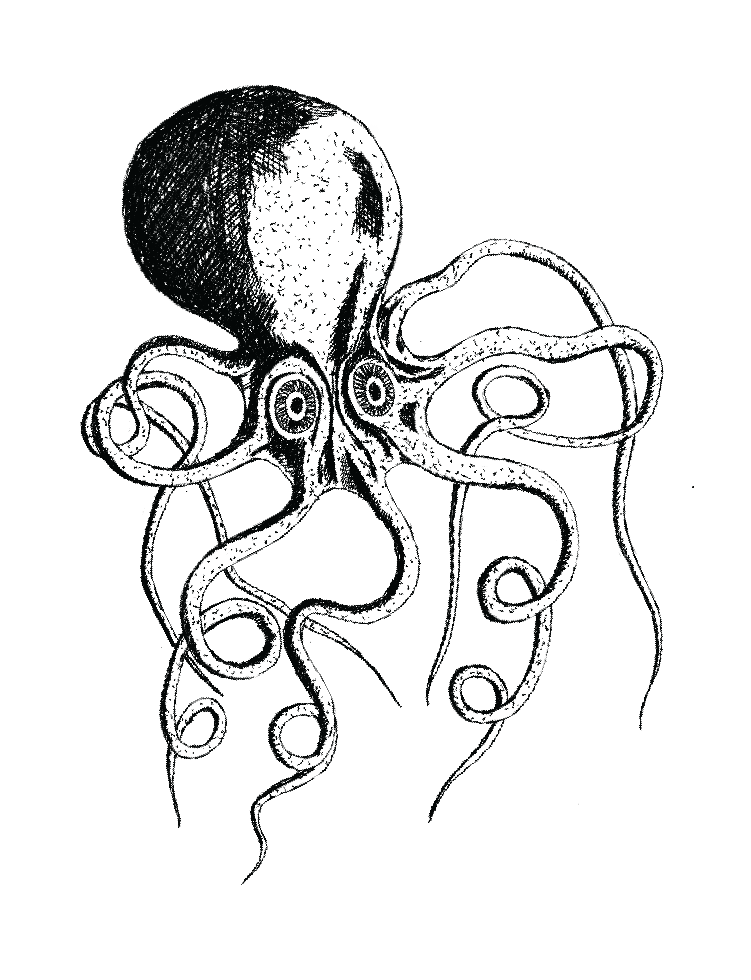
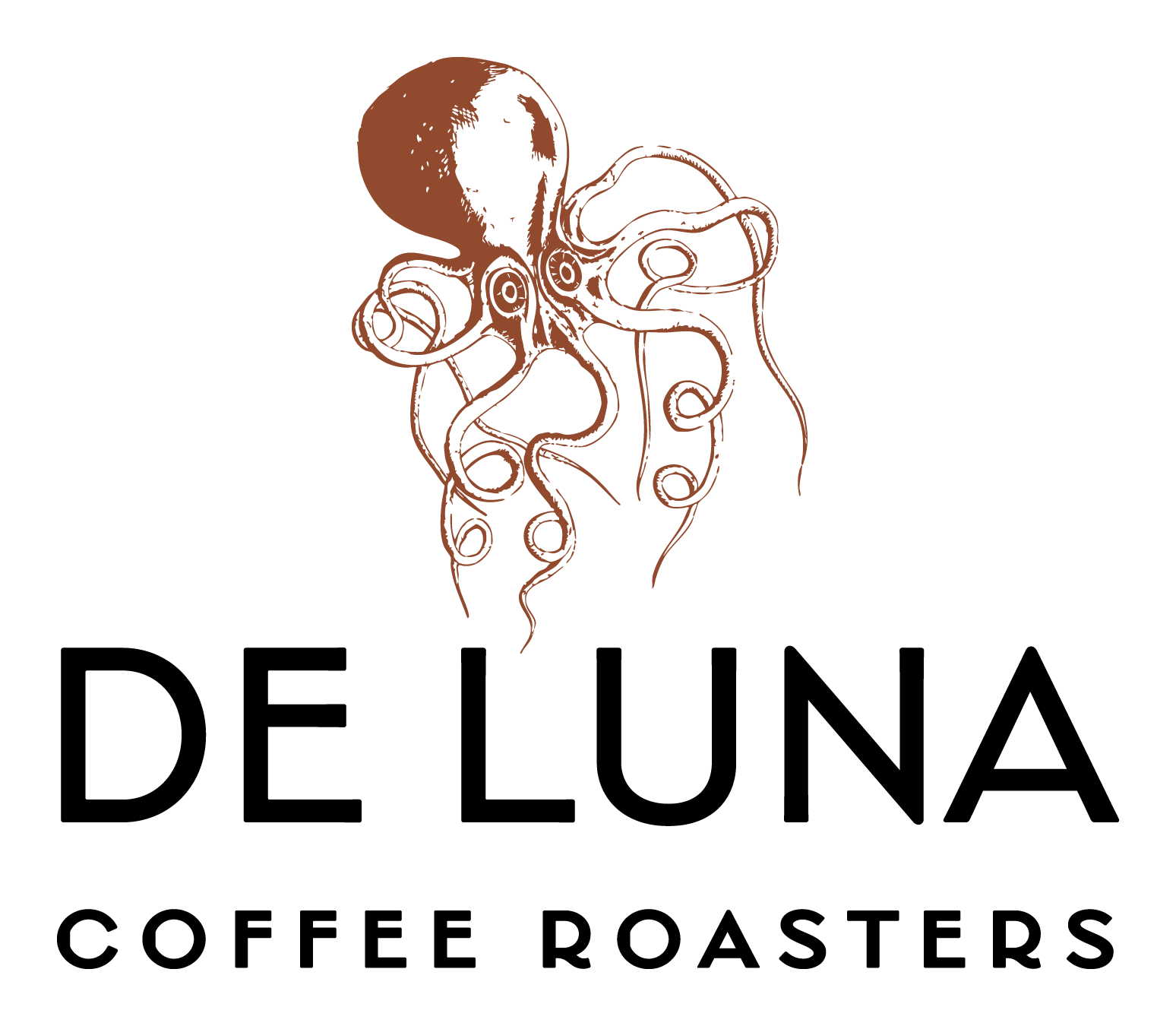
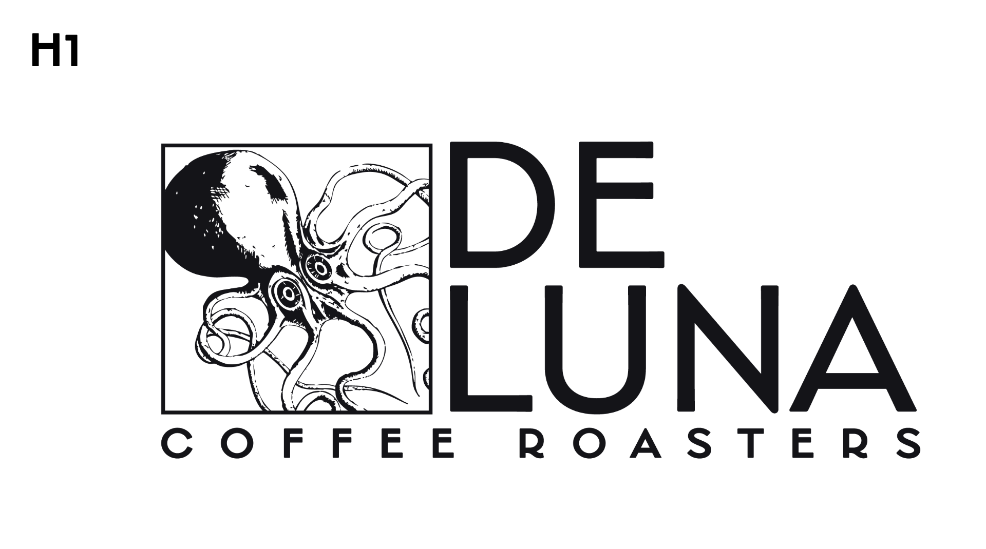
De Luna Coffee Roasters is a local, family-owned business focusing on retail bags of freshly roasted coffee in the Pensacola area. I reached out to the owner, and he acknowledged that they needed a rebrand. It was my first big rebrand project, and it was so much fun. After lots of conversations and brainstorming sessions with the De Luna team, we landed on a tasteful nautical theme that was relevant, but that didn't rely too much on trendy design language. After the initial logo redesign, I was also able to apply their new identity to a packaging concept for their retail bags. They were very pleased, I learned a lot, and I am excited to see the new and improved De Luna Coffee Roasters' image out in the wild.
Generation Church/ACTS Graphics
Generation Church in Pensacola was excited to begin a new sermon series through the book of Acts, but they needed a visual identity to hold everything together. They wanted to tell the story of the early church and how it began— in homes, around tables, and over meals. I was very pleased with the final product, and it was a great experience to work alongside people with a passion for their work, and this bled into their desire for a visual identity that reflected this passion.
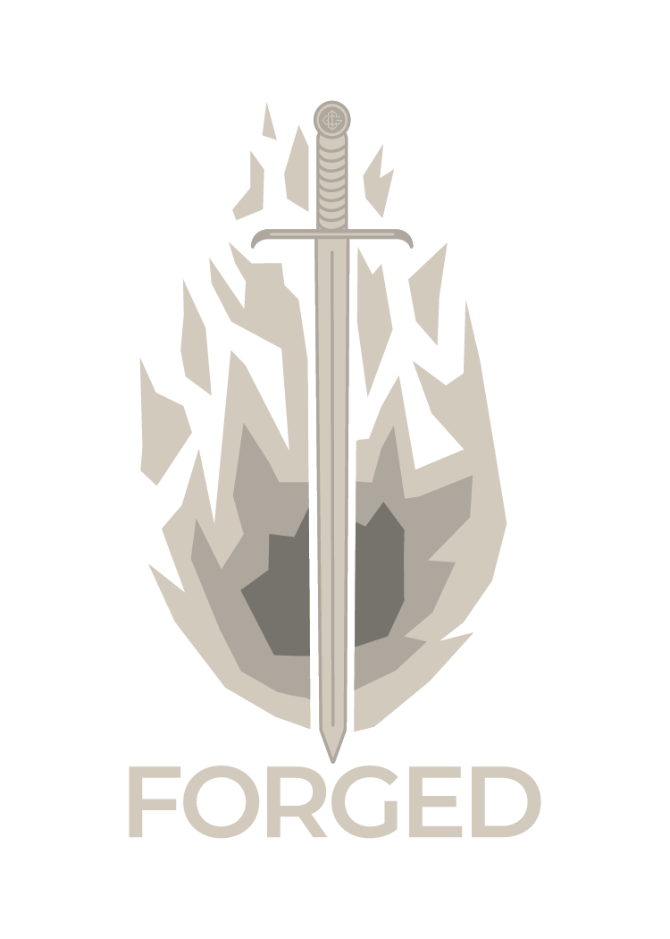
Generation Church/Forged Logo
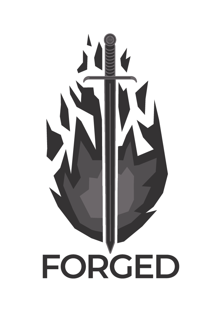
Because of my work with the ACTS sermon series graphics, Generation Church reached out again with a logo job for their men's community group called "Forged". The concept for this project was built around the idea of "iron sharpens iron" from Proverbs 27, and the team at Generation wanted to use imagery from a medieval forge to communicate this. This project is a good example of flexibility and collaboration, and I really like the finalized graphic.

Logan Pilcher Shirts
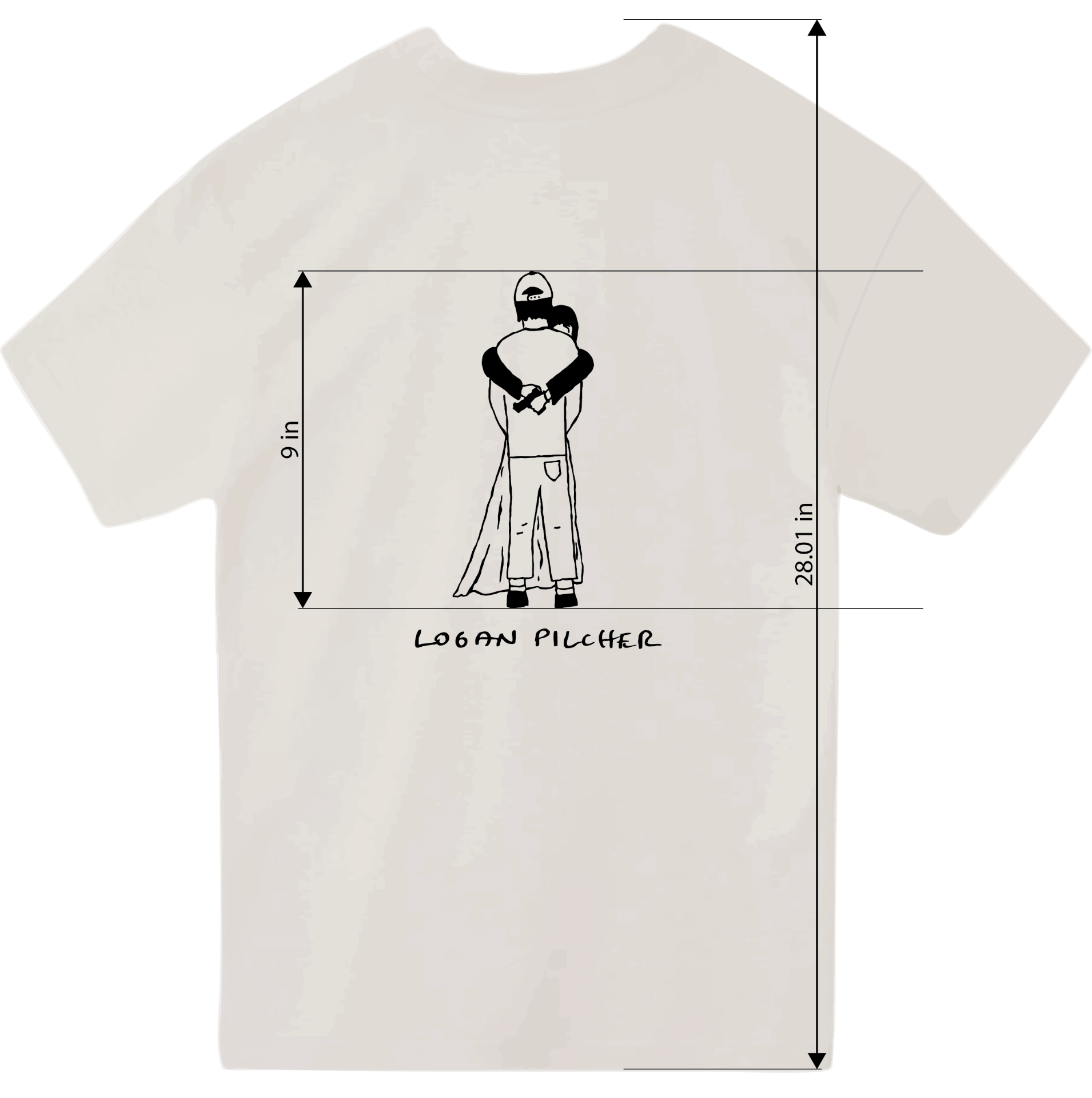
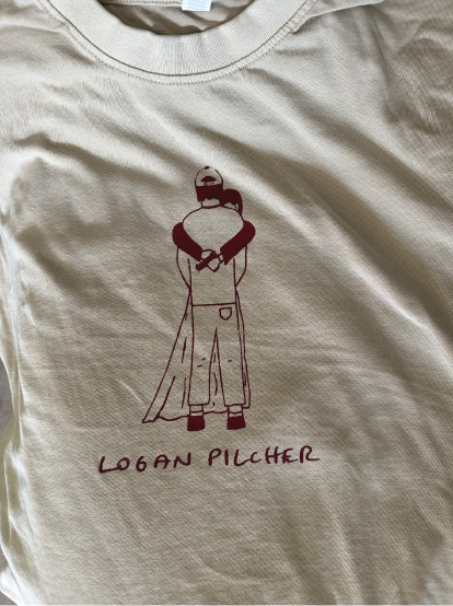
A local musician reached out and needed new merch for his tour that was less than a month away. He sent me some lyrics from his new songs and we landed on this line "there's not a good way to tell you that I don't love you" and we liked the imagery of a pistol. After some brainstorming, we came up with a graphic of a couple embracing, the woman holding a gun behind her partner's back. This was a super fun project and a great example of helping to develop a brand beyond a logo and name.

like what you see?
Tell me about your project.